
Monday, 3 December 2012
Forgot to post this...
Ink in Water...
Have found the most AMAZING images using ink and water, to see below...


Research into what visual language my adverts should include.

It's come to my attention that the main way I will be able to get the attention of the millionaires out there is to stick to the 'arty' approach. It may sound simple, but they will pay no attention to something tacky or in your face, the image will be the selling point, maybe taking into account the art of dropping the tea into the water, something to do with tea in water. Sounds so confusing right now, but there's something between how much the rich spend on art, it's like their main hobby (see other post), art collecting;
"oooh, have you seen this new Rothko piece I spent $87 million on?"
I'm literally not kidding some guy will have said that...
"Contemporary art is becoming the gold of the new rich. This week’s strong auction sales in New York brought record bids for Rothko, Klein, Lichtenstein and several other post-war artists. Scarcity is part of the allure, along with taste and the spending power of the global plutocracy. One thing to please at least the financiers among them is that contemporary art has inked good returns, too.I definitely think that this is the way I should go with my art, they should maybe be print/digital image. I am definitely keeping with the Harrod's digital advertising space. This honestly REALLY excites me, I can just see images of some coloured fluid dropping into black and 'infusing' into the area, with the word OPULENCE seeping through, followed by the website or something... a storyboard and further research should follow.
Mark Rothko’s “Orange, Red, Yellow” fetched nearly $87 million at Christie’s, topping the bill at the auctioneer’s $388 million sale, its biggest ever. That’s a sign that the Contemporary category – albeit increasingly not an accurate description – has the upper hand these days, even if the all-time record, set by Sotheby’s with Edvard Munch’s “The Scream” last week, was officially in the firm’s Impressionist and Modern sale.
That’s further underlined by the trajectory of prices. Artnet’s Contemporary 50 index is up more than five-fold since 2001, against a mere 60 percent gain for the Impressionist 25 benchmark – and that’s before this week’s sales. Contemporary art dipped in 2009 with the global financial crisis, but recovered by 2011.
Like, say, high-end London property, expensive art is now a global market – it’s not like the end of the 1980s when Japanese buyers, who dominated auctions for Impressionist works, suddenly disappeared. If European collectors are cautious – as might be expected with financial tremors still rumbling around the region – there are plenty of U.S., Middle-Eastern, South American, Russian and Asian buyers to take their place."
Saturday, 1 December 2012
After not being able to sleep and thinking about ambient ads...


Ambient Ads make reaching a large amount of people a really easy job to do, obviously creating them is the hard part. This would really help me with reaching my target audience, as my research has shown me that Rich people aren't going to pay attention to TV adverts and millionaires have better things to do that search the net for their next product to buy. I think that in doing an ambient ad it will give me the option to make something striking and create an image that can be repeated across the globe, or make people wonder, what is that doing there?! and then they will in turn do some research into it and find out, which in turn makes them find my product. I need to make sure I keep with the stylised art theme and catch their eye.
Friday, 30 November 2012
I LOVE MY MUM.
Told my mum about my idea for my product and so on and she got back to me with the following...
So here we go... Once again I'll highlight the most important parts.


"Fantastic idea about the tea. You have to go back to the 17th & 18th century though for some more ideas. Tea was soooo expensive then only the upper classes could afford it and they locked it away in very ornate tea caddies and actually had parties where they just drank tea, one to drink it and two to show off how much money they had. Google tea caddies and you will see some really impressive ones some go for as much as £150,000 at auction now depending on their condition. Maybe your tea could be boxed in something similar to be exported to these wonderful parties and events that it would be drunk at.. It could all help towards your research"
So here we go... Once again I'll highlight the most important parts.
Literally possibly the most important research I could have done, and I've only come across it now. This really fits with the work I am doing, I love my mums idea of serving my tea in Tea Caddies, like little vials or bottles within the caddy... for visuals of a tea caddy you need only look below...During the late 17th and through the 18th Century, tea was very expensive. The price would fluctuate due to the great distances travelled and the safe arrival of ships from China. Looking at some prices quoted by a London tea merchant in 1787 you could buy basic tea for the modern equivalent of about £20 per pound weight (500gm) or fine tea for about £60 per pound weight! It is obvious why only the nobility or merchant classes could afford to drink tea!Due to the price, tea was drunk (or ‘taken’) as a very formal social beverage, certainly not to quench the thirst! It’s rarity and price meant that only tiny amounts were taken in very small Chinese tea-bowls. In England we didn’t like placing our hot bowls or cups on our expensive wooden tables leading us to look at the available Chinese porcelain wares and often use the small sauce bowls to place hot cups upon. Hence the term ‘saucer’.Tea was coarse-cut at this time which meant a lot of waste in the bottom of the cup. This is why tea services included a waste or slop bowl in which to discharge the waste between pourings. The tea-bowl could become hot so people may lift the bowl to the mouth on its saucer or even tip the tea into the saucer. In these cases you would also need a spoon tray to place the spoon in! Etiquette differed from house to house.Those that could afford the best would order their tea-bowls with handles. These early handles can look very strange being merely stuck onto the side of a tea-bowl with little thought for aesthetics. The handled tea cup was reserved only for the most expensive tea-services. The handle became more popular during the last quarter of the 18th Century and the tea-bowl eventually fell from use by about 1820. During this period the tea cup also became wider as tea prices reduced. Price reduction also led to tea being taken at breakfast time to quench thirst, again in much larger cups.The wider cups allowed tea to cool quicker and handles on cups reduced the need to drink from the saucer. The saucer therefore started to ‘flatten out’ a little and eventually, during the 1840’s, incorporated a little recess in the centre in order to prevent the cup from slipping around. By this time, falling tea prices saw the working classes able to afford tea for the first time. Since 1850 the teacup and saucer have changed very little - apart from the fact that most of us unfortunately use the ubiquitous ‘mug’ on a daily basis! (http://www.antiqueporcelaincollector.com/about.html)
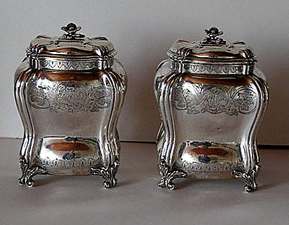
Pair of Tea Caddies by John Kincard London 1756

Maker Unknown Circa 1767
For some reason in my head, the kind of caddy for my tea looks a bit like this ornate cabinet I found on google (as always). A place to store your 'Opulence' products.
The world's most expensive tea.
Now this is interesting... Panda Poo.
Tea Made of Panda Poo...
Who makes this? Chinese entrepreneur An Yanshi, of course.
As this product hasn't even been made yet it's hard for me to scrutinize it, however this is the furthest from my product you could get, it's taking something completely crazy and trying to sell it as the healthiest tea in the world... oh wait, that is what I'm doing. I'm just glad I'm not trying to sell tea made from panda poo... now that's a hard task. Least mine's going to have gold and maybe a few diamonds.
Tea Made of Panda Poo...
Who makes this? Chinese entrepreneur An Yanshi, of course.
"The former calligraphy teacher has purchased 11 tonnes of faeces from a panda breeding centre to fertilise a tea crop in the mountains of Sichuan province in southwestern China, home to the black and white bears.
An says he will harvest the first batch of tea leaves this spring and it will be the "world's most expensive tea" at almost 220,000 yuan ($35,000) for 500 grams (18 ounces)." (http://www.telegraph.co.uk/earth/wildlife/9004086/Secret-to-worlds-most-expensive-tea-Panda-droppings.html)
As this product hasn't even been made yet it's hard for me to scrutinize it, however this is the furthest from my product you could get, it's taking something completely crazy and trying to sell it as the healthiest tea in the world... oh wait, that is what I'm doing. I'm just glad I'm not trying to sell tea made from panda poo... now that's a hard task. Least mine's going to have gold and maybe a few diamonds.
Vodka Advertisements

Diva Vodka Advertisements.
This Vodka is made with colored swarovski crystals (or 'gems' as they call them in a center column in the bottle.
Various color versions as well as custom colors are available.
Various color versions as well as custom colors are available.
I personally think that the different colours down the centre are very suitable to what I need to do with my products, somehow my 3 products need to look the same but at the same time have 3 very different uses and this needs to be visible either in the advertisements themselves or in the packaging of the product. I love how beautiful these bottles are, it's a shame they're ruined with the terrible typography (bit harsh?).

Diva Vodka describes themselves as 'The worlds most glamorous vodka' which to me is a pretty lazy end-line but there we go. Everything about this vodka is obviously aimed at women; the multi-coloured swarovski crystals, the brand name 'Diva', the visuals of the vodka linked to beautiful flowers (white roses; innocent, pure) or incredible rings (wealth, beauty). Again, like the Bollinger ads, the bottle is centre of the advertisement. They are well lit, the liquid inside basically unnoticeable which gives you the sense of a perfect vodka, absolutely clean. A bottle of this stuff is going online between £50-£65 for a 70cl bottle.

I love that this vodka has it's own website, something I was considering doing with my product, although like this one, my product wouldn't be available to buy online from the website. The most interesting thing I found on the website (www.divavodka.co.uk) was that there was a downloadable 'brochure'. This excited me a heck of a lot, but I was dissapointed to find that it was basically a two page PDF file with the shown picture of a '1920's' classic, beautiful woman with a bottle of Diva Vodka stamped in the bottom right hand corner. The second page constisted of a bigger image of the bottle with a description of the vodka along side "Diva Vodka is a wheat-based vodka that is triple distilled and
ice-filtered through Nordic birch charcoal.
The bottle contains a tube filled with crystals that can be used
as a garnish. The 48 crystals in each bottle include cubic zircona,
smoky topaz, pink tourmaline, amethyst, citrine and peridot and
the crystals in each bottle are hand-filled with each bottle having a
unique combination of crystals."
The images aren't even of a good quality which doesn't really stick with the brand's obvious 'glamorous image'. However I think that what they have set out to do with their brand is pretty similar to my outlook, the main differences being that mine is to start a new way to drink tea and will be available to everyone, not just aimed at women. Also something nice to add that I just found out 'The DIVA premium ranges in price from $3,700 and $1 million.'

Oval Vodka Advertisement
Oval vodka is by far my favourite branding. 'Vodka's Natural Evolution' really excites me, the world evolution, is brilliant! It makes the reader feel that this is the way the world was meant to be, the world evolved so that Oval vodka could exist, making it a part of history. It's just brilliant. But with a pricetage of £45 for 70cl I don't think I'll be buying any, any time soon. They've obviously gone with a 'space-vibe' for this advertisement, fitting with the evolution idea. The blue's work really well, still keeping the vodka looking pure and crystal clear while fitting in with the end-line connotations. I also like how they've included a 'martini/cocktail' glass in the background to promote the fact that their drink is to be enjoyed best in something seen as 'posher' (sorry for my shocking grammar) rather than enjoyed in a long glass with a mixer such as coke/lemonade.It also gives off the idea that this vodka could maybe enjoyed straight, cause you aren't going to fit much else in that glass.
The liquid coming out of the bottle seems to be taking the form of something other-worldley, something completely different to anything you've seen vodka do before in other words. It's also a very beautiful composition, whatever it is, and reminds me of microscopic cells (once again linking to the idea of evolution). The vodka is becoming a part of us (I know vodka is definitely a part of me).
Well, just been on the website and found this "We recommend that you drink OVAL Vodka straight and not too chilled. (14-15C/57-59F)" which definitely shows what I thought the advert was trying to say... drink it straight.

Taken from the website this vodka's main aim is obviously PURITY, as is so nicely written in capitals on the main page (http://www.oval-vodka.co.uk/) I really love the branding of this vodka, the simplicity, love something when it's simple. As you can see from the image on the right they've gone for the blinged out look, and if I'm not mistaken that bottle on the right retails at $6,922, the bottle is limited edition and is festooned with 7000 Swarovski
crystals. The showcase of the bottle has to be a luxurious one hence it
was displayed on "The Glorifier," which is a rotating LCD display unit,
highlighting the sparkling Swarovski crystals.
The bottle is available only at the exclusive places like well-known
night clubs and Embassy, Dolce, Amika, Maya, Tramp, Maddox and
Chinawhite.
If it's hard for you to read the bottom paragraphs this is one of my favourite exerts '
The exceptional aspect of structured OVAL Vodka is its distinctively
harmonious taste, its absolute purity and premium-class quality.
In this way, its multifaceted taste components are able to unfold
sip-by-sip. Drinking OVAL ice-cold, as is usual with other vodkas, hides
all its aromas and represses the taste receptors.'
You can't go wrong with words like distinctively harmonious, absolute purity, premium-class, multifaceted, taste receptors. All sounds so thrilling.
I think it's important for me to look at adverts for the world's most expensive drinks, such as Vodka and Champagne. I also think it's important to add that these drinks tend to be alcoholic, alcohol being one of the world's favourite indulgences. I heard the most amazing thing yesterday watching Russel Howard's Good News, it was a scene taken from a news show looking at the recent floods in the UK and one of the locals was talking about how he was trying to help some people stranded in a rubber dingy in the middle of the flood he said the following 'Well I gave them the essentials you know, wine and vodka' god I love being British.
With my brand being tea I think it's time for a post on the world's most expensive tea, showing the differences that will be between said tea and my product, and the similarities that will be between my product and these expensive alcohols.
Subscribe to:
Comments (Atom)